Brand Guidelines
Purpose
These guidelines ensure consistent and effective representation of Jeweld Consulting, a proud Black and woman-owned business, across all platforms and materials. They are designed to maintain the integrity of our brand while celebrating our deep commitment to community and equity.
Overview
Jeweld Consulting’s brand identity is a blend of warmth, competence, and a strong community focus. As a Black and woman-owned business, we emphasize equity in everything we do. This document provides guidance on using brand elements consistently while allowing for flexibility in sub-brands and events.
If you have any questions, please contact marketing@jeweldconsulting.com.
Jump to Section
Who We Are
Use this boilerplate copy any time you need to give an overview of Jeweld Consulting.
Short Version
Based in Oakland, Jeweld Consulting helps organizations and leaders create a more just, equitable future through tailored consulting, coaching, and event management.
Long Version
Based in Oakland, Jeweld Consulting partners with government agencies, nonprofits, and leaders to build a more just, equitable future. We provide tailored consulting, executive coaching, and event management to drive strategic planning, leadership development, and lasting community impact.
Language Commitment
Because of our commitment to equity and respect for individuals, Jeweld Consulting prefers to use the term “Black” when referring to racial identity.
“Black” is a broader and more inclusive term, recognizing that not all Black individuals in the U.S. identify as African American. For example, someone from Jamaica who lives in the U.S. may identify as Black but not African American.
We also capitalize “Black” as an acknowledgment of its significance beyond color—it reflects a shared identity, culture, and history. This choice is intentional and aligns with our values of inclusivity and respect for the diverse identities within our community.
Tone of Voice
All copy, presentations, surveys, webpages, social media posts, emails, etc. should embody these attributes.
Empowering & Uplifting
Reflects the strength, pride, and resilience of the Black community and women entrepreneurs.
Our messaging should inspire confidence, using language that highlights
positive change, leadership, and the impact of collective action.
Competent & Trustworthy
Content should convey expertise and reliability.
Personal & Authentic
Reflects the genuine and personal nature of Jeweld Consulting’s approach. Avoid overly formal language.
For example, instead of “We facilitate leadership development programs,” say
“We help leaders grow and succeed through tailored coaching and training.”
Bright & Lively
Positive, hopeful, and enthusiastic while remaining grounded in expertise.
Equitable & Inclusive
Ensures language is inclusive and promotes fairness and equal opportunities.
Clear & Understandable
Clear, easy-to-understand language; avoid jargon and corporate-speak. Use straightforward sentence structures and active voice whenever possible.
For example, instead of “Facilitation of strategic planning sessions will be
conducted,” say “We will facilitate strategic planning sessions.” Avoid technical
or industry-specific jargon unless necessary, and always provide explanations
when complex terms are required.
Brand Identity
Use Full Name, Title Case
When first mentioning the organization, the full name should always be written in Title Case: Jeweld Consulting.
Subsequent mentions of the organization may be shortened to “Jeweld.”
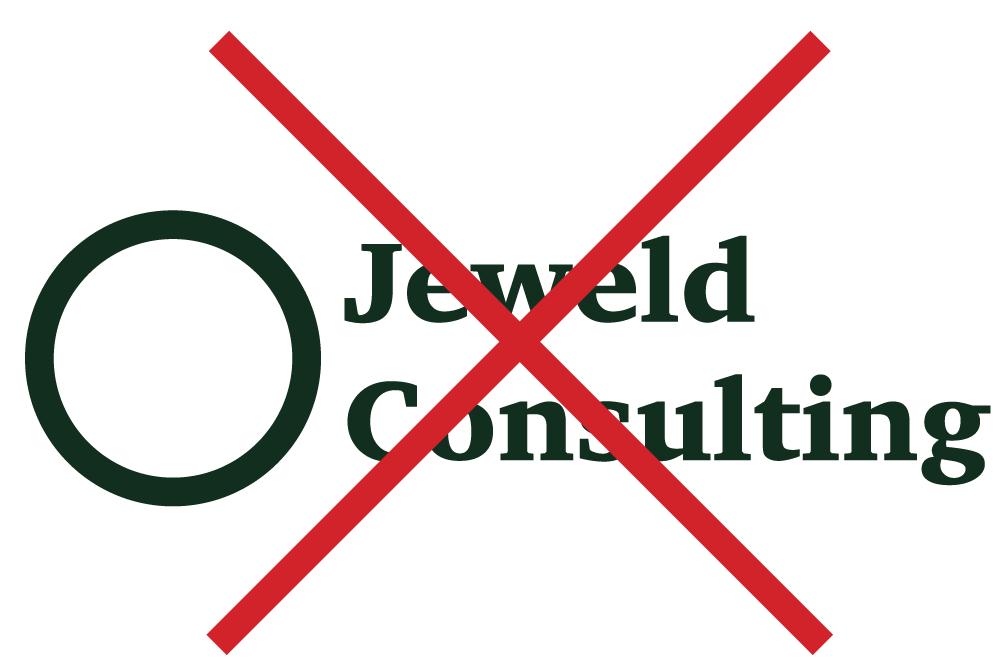
Do Not Italicize or Bold the Brand Name
Never italicize or bold Jeweld Consulting unless the text around it is bold or italicized.
Correct Style
We met with Jeweld Consulting last week
Incorrect Style
We met with Jeweld Consulting last week
Correct Style
We met with Jeweld Consulting last week
Incorrect Style
We met with Jeweld Consulting last week
Primary Colors
Dark Green
Hex: 132D1E
CMYK: 81, 53, 79, 69
RGB: 19, 45, 30
Pear
Hex: CADB2B
CMYK: 25, 0, 100, 0
RGB: 202, 219, 43
Timberwolf
Hex: F0E7EB
CMYK: 4, 8, 3, 0
RGB: 240, 231, 235
Secondary Colors
Persimmon
Hex: F16622
CMYK: 0, 75, 100, 0
RGB: 241, 102, 34
Mint
Hex: BDD6D2
CMYK: 26, 6, 16, 0
RGB: 189, 214, 210
Brinjal
Hex: 4C2C69
CMYK: 83, 96, 28, 16
RGB: 76, 44, 105
Chocolate Cosmos
Hex: 38151F
CMYK: 53, 82, 62, 71
RGB: 56, 21, 31
Fonts
Zin Display
Headers & Logo
A modern font used for impact and distinctiveness
Gill Sans
Body Text
A clean sans-serif font for readability
Using Fonts
Both of these fonts will need to be downloaded and installed to your computer. Only use Zin Display for headers. Gill Sans should be used for subheaders and body copy.
When using Gill Sans, only use Bold and Regular options. You may use SemiBold in rare circumstances where the font is too small to be legible.
Choosing Font Size
For simplicity, we recommend using the 2:1 rule when selecting font sizes. This means that headers are 2x the size of body copy.
In other words, if your body copy is 12 pt, headers should be 24 pt.
If you use subheads, they should fall halfway between the two sizes, which in this case would be 18 pt.
This is a Header
This is a Subhead
This is body copy. In this example, the body is sized at 1.6 rem while the header is twice that size (3.2 rem). The subhead falls halfway between the two (2.4 rem).
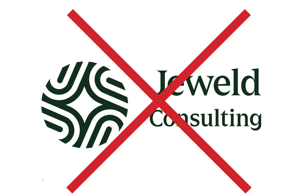
Logo Design
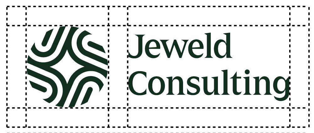
Anatomy of a Logo
The Jeweld Consulting logo represents more than an organization. It represents the community and the inspiration behind the name.
Logos
Two Versions
There are two versions of the Jeweld Consulting logo:
- Full Logo
- Icon Only
Using the Correct Color
Use the light icon/logo on a dark background.
Use the dark icon/logo on a light background.
Logo Usage
Using the Logo
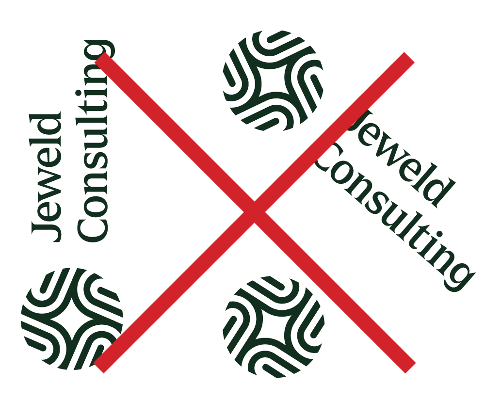
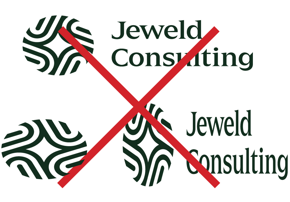
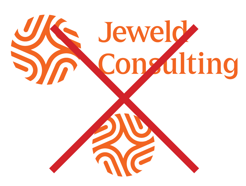
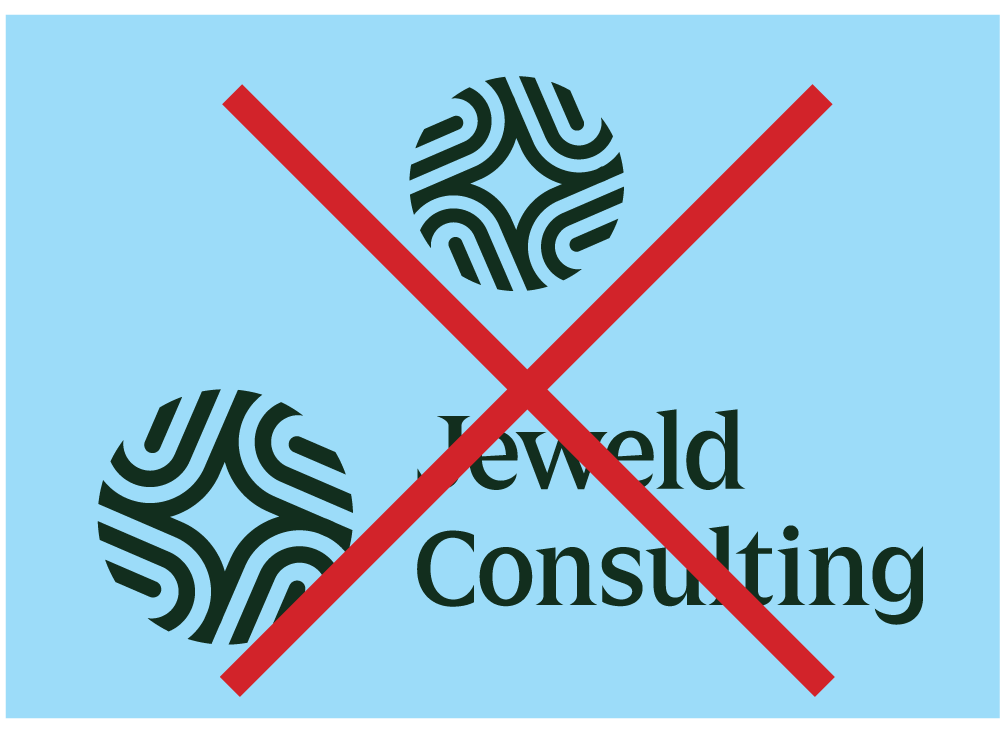
The logo must be used as is and not altered in any way.
Do not:
- Change the logo’s orientation or rotation.
- Disproportionately scale or resize the logo.
- Change the logo’s colors.
- Place the logo on a non-approved color (except black or white)
- Display the logo in a configuration not previously specified.
- Attempt to recreate the logo.
- Make alterations to the logo’s text.
- Add special effects to the logo.
- Add an outline to the logo or display the logo as an outline
- Use the logo on top of busy photography
- Display other elements within the logo’s designated clear space.
- Crop the logo in any way


Keep the Logo Free of Clutter
Adhere to Safe Space
The area surrounding the logo must be empty. You may not have text, designs, textured backgrounds, or anything else in this space.
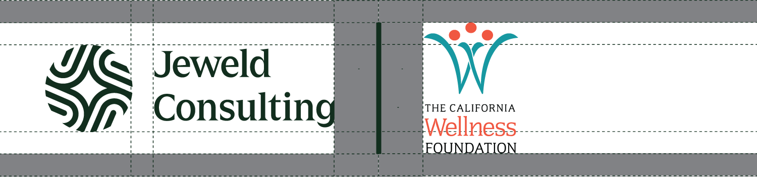
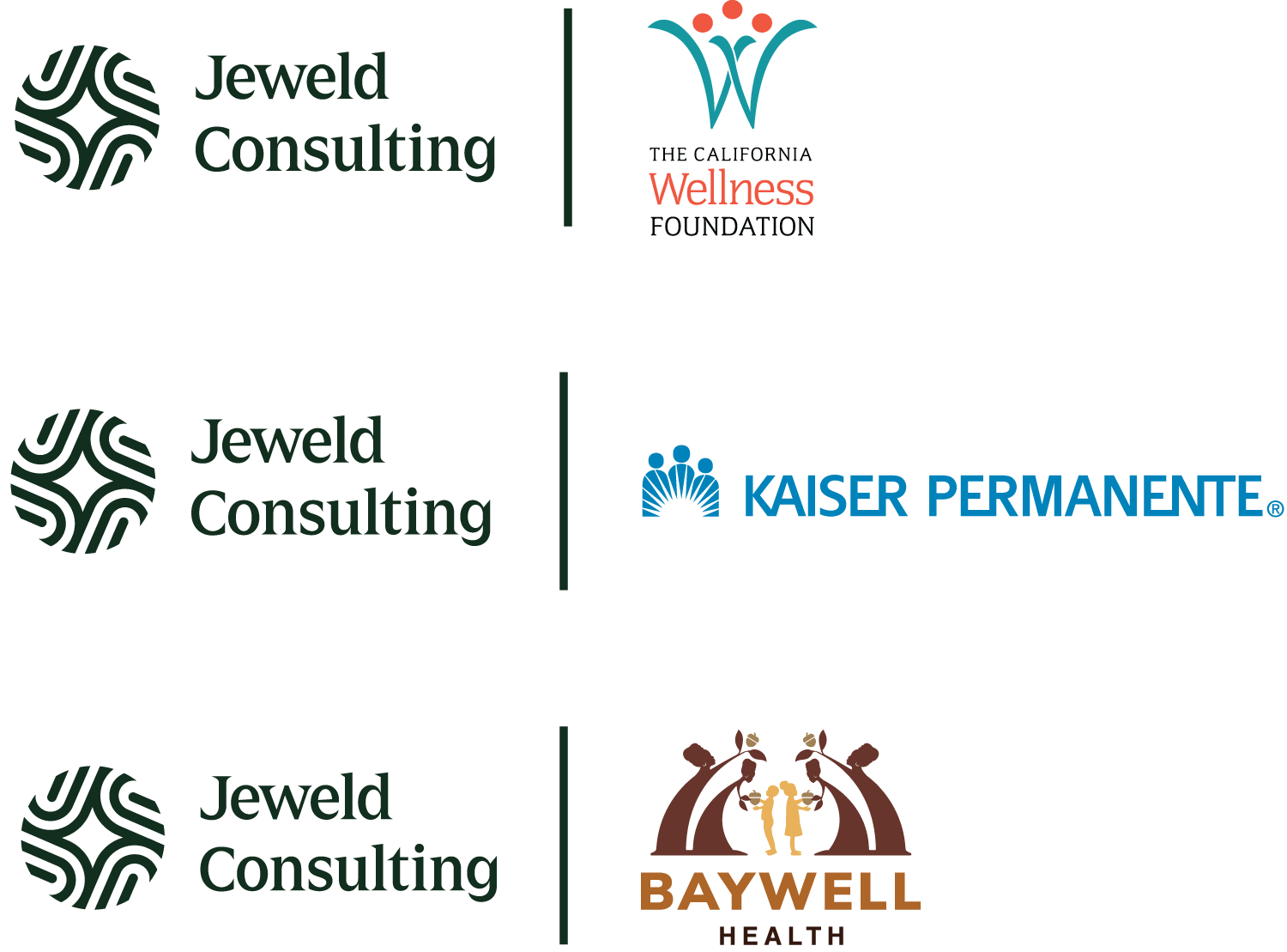
Co-Branding Logos
Two Logos
When only two logos are used (Jeweld
Consulting + Partner), adhere to the appropriate spacing between the logos.
There should always be a bar between the logos. The space between the bar and each logo should be 2x the space between the Jeweld Consulting icon and the Jeweld Consulting logo.
Logos should be given equal weight, but a logo should not ever exceed the vertical height of the bar. The bar’s height should always follow the template seen here.
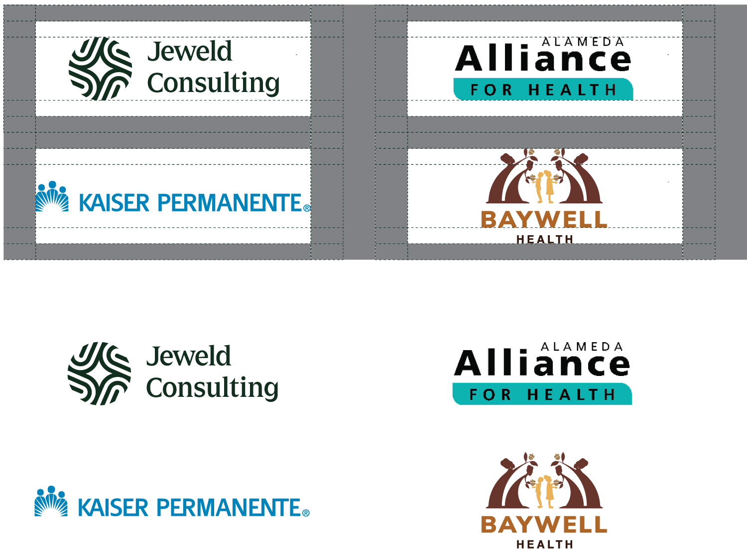
Multiple Logos
When multiple logos are used, logos should always fit within the template to the right.
Do not use icon-only logos in any co-branded piece of collateral.
Visuals & Photography
Round Cropping
All photos and graphics should be cropped with round edges to signify safety, approachability, and friendliness.
Reflect Our Work
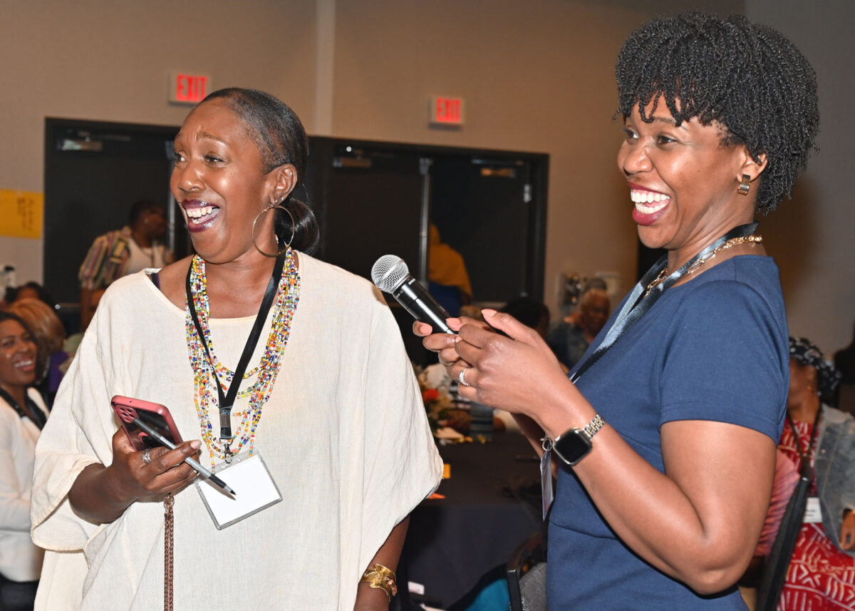
Photos must reflect Jeweld’s work in the Black community and need to have an uplifting, empowering feel to them.
Avoid Posed Photos
We are an action-oriented organization. Photos should show people looking natural and/or taking some sort of action. No posed photos.
Header Here
DO NOT: Use blocks with sharp edges
Header Here
DO: Use blocks with rounded edges

DO NOT: Use posed photos
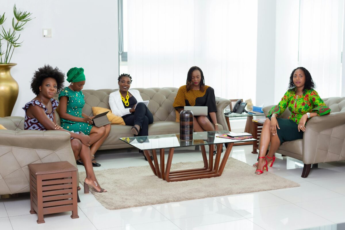
DO NOT: Use posed photos
DO NOT: Use photos with sharp edges
DO: Use photos with rounded edges that follow the brand guidelines
Letterheads & Presentation
Two Versions of Letterhead
The standard letterhead should be used for all external letters that do not require the use of multiple or large tables.
The simplified letterhead should be used for documentation and external letters that require the use of multiple, large, or complex tables.
Please ensure you follow the instructions for using each letterhead (seen when clicking the “download” link).
Presentation Template
When creating a presentation for Jeweld Consulting, you must use this template.
Do not attempt to export the deck to PowerPoint. In order to maintain the correct design specs and fonts, you must use Google Slides.
Please ensure you follow the instructions for using the presentation template (seen when clicking the “access” link).